Typography
Our fonts, styles, and colors with backgrounds
Our fonts, styles, and colors with backgrounds

The CENTURY 21® digital brand supersedes the master brand guidelines for typography usages. The distinct characteristics of our text formatting guidelines optimize the readability, accessibility, usability, and overall graphic feel of the brand. Line widths, line spacing, section spacing, contrast, and alignment all play an essential part in how content is perceived
All text must pass all current ADA and WCAG AA text spacing specifications, including:
The text should be easy to read. All text is left-aligned unless specified differently. This treatment is ideal for both accessibility and usability best practices. Any text that isn't left-aligned is limited to a specific component and must provide a particular design benefit. Use headings to communicate the organization of the content and break up content into sections. Limit the use of font variations such as bold, italics, and ALL CAPITAL LETTERS. Too many fonts and font variations are confusing and more challenging to read.
Low-vision encompasses a wide and variable range of issues across people. These guidelines provide a baseline; however, it is essential to ensure that people can override text spacing to improve their reading experience. Additionally, the text should be capable of being scaled at least 200% so that it can be read directly by people with mild visual disabilities without requiring the use of assistive technology such as a screen magnifier.
Please be advised that the ADA legal landscape is constantly evolving. You are required to ensure your business is in full compliance and we encourage you to consult with your attorney.
Headline
Headline
Headline
Headline
Headline
Headline
Tagline 1
Tagline 2
Tagline 3
Body
Body Lead
Button 1
Button 2
Legal
Numbers
Form Label
Hint
Helper
These font sizes should serve as the default values for most situations. Exceptions should be made when legibility, accessibility, or understandability would be compromised.
Sizes are provided as mobile-first, with overrides for medium (tablet) and large (desktop) screens.
| DEFAULT | MEDIUM SCREEN |
LARGE SCREEN |
Letter Spacing | |
|---|---|---|---|---|
|
Headline 1
Headline 2 Headline 3 Headline 4 Headline 5 Headline 6 |
32px
28px 24px 21px 16px 16px |
52px
32px 26px - - - |
65px
36px 28px - - - |
0.01em
0.01em 0.01em 0.01em 0.01em 0.01em |
|
Tagline 1
Tagline 2 Tagline 3 |
19px
14px 16px |
26px
16px - |
32px
18px - |
0.1em
0.1em 0.1em |
|
Body Text
Body Lead |
16px
20px |
-
- |
-
- |
0.01em
0.01em |
|
Large Button 1
Standard Button 1 Small Button 1 |
16px
16px 14px |
19px
- - |
21px
- - |
0.02em
0.02em 0.02em |
|
Large Button 2
Standard Button 2 Small Button 2 |
16px
16px 14px |
19px
- - |
21px
- - |
0.1em
0.1em 0.1em |
|
Numbers
Legal |
inherit
16px |
-
- |
-
- |
0.01em
0.01em |
|
Form Label
Form Input Form Helper |
14px
16px 14px |
-
- - |
-
- - |
0.01em
0.01em 0.01em |
Headlines range from H1 - H6 offering a variety to display the information hierarchy throughout the content of the page.
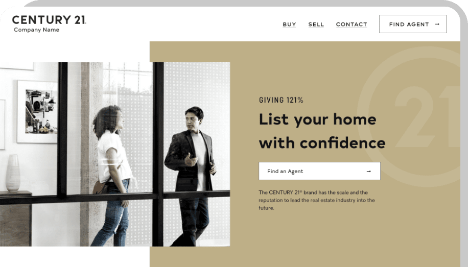
Example of a Headline 1 in a hero
On mobile
Digital branding guidelines as a whole limit the use of uppercase typography to reduce the cognitive load for users.
Sentence case typography is easier for people to read, with or without disabilities.
Use sentence case for all headlines, taglines, and buttons greater than 2 words.
Don’t add excessive horizontal spacing between the letters in sentence case headlines.
Use the primary typography as the default headline font style.
Don’t use a line-height (line spacing) that is less than 1.5 times the font size.
Use primary and alternative font weights in headlines to indicate visual priority and emphasize specific words.
Use caution when mixing sentence case and uppercase fonts in a headline as it can make headlines hard to read.
Taglines provide additional context for headlines and allow text blocks to be visually separated while also allowing intentional use of the prominent brand colors.
Example of a tagline above the H1 in a hero on desktop
On mobile
The default font case for taglines is capitalized. This is one of the only digitally approved fonts where we utilize uppercase as a brand standard as the legibility is questionable.
In general, be mindful of the amount of words used in taglines to ensure it is legible and valuable for users.
Taglines are typically used in unison with Headlines to add additional context for the user.
Use all capitalized letter case for taglines with (2) words or less.
Use caution with taglines that have more than 2 words as uppercase type is hard to read.
Use the approved colors for all fonts on light backgrounds.
Don’t use non-approved fonts on light backgrounds.
Don’t allow taglines to stack into 2 lines.
Body copy needs to be easy to read which is why we use Oakes Regular and Bold as our standard.
All copy needs to have a contrast ratio of 4:5:1 to it’s background.
Copy on light backgrounds is defaulted to #121212 on every device.
Example of an body text through a content page
On mobile
Use consistent body text size, color, font, and case.
Don’t use non-approved colors or a mix of sentence and uppercase in excess for body copy.
Legal disclaimer has one font that is condensed to make the most of the space.
Example of legal disclaimer in a footer on desktop
On mobile
Use the defined font for all legal disclaimer.
Don’t use the defined font for body copy.
Use the defined font for all legal disclaimer in forms.
Don’t use the legal disclaimer for captions in forms.


