Colors
These colors and tones are the new brand guidelines that are being adopted in part for ADA purposes
These colors and tones are the new brand guidelines that are being adopted in part for ADA purposes

The CENTURY 21® digital branding guideline colors supersede the master brand guidelines for all digital content, including websites, email, and PDF files distributed online. Colors that are only used in digital marketing begin with “digital” in their name. All text and UI elements must pass the WCAG 2.1 AA contrast specifications.
Please be advised that the ADA legal landscape is constantly evolving. You are required to ensure your business is in full compliance and we encourage you to consult with your attorney.
#BEAF87
#252526
#746649
#121212
#FFFFFF
#727273
#517394
#6E8FAF
#8D312E
In order to provide versatility and cohesiveness of digital designs, a limited selection of tints and shades of the brand digital palette may be used.
Tints and shades must meet ADA/WCAG contrast requirements.
The following tints should be used in the suggested pairings provided in this document.
#DED7C3
#F8F7F2
#C4C4C5
#F4F4F6
#B9B2A3
#F1EFEC
These text and background color pairings are acceptable to use in all cases, and have no restrictions on use.
All digital designs must meet current ADA & WCAG level AA requirements. Current regulations require a contrast ratio of at least 4.5:1 for normal text, 3:1 for large text, and a contrast ratio of at least 3:1 for graphics and user interface components.
…help you Find an agent to sell…
Background:
#FFFFFF
Primary Text:
#121212
Alternate Text:
#746649
Links:
#517394
Link Underline Hover:
#28394A
…help you Find an agent to sell…
Background:
#F4F4F6
Primary Text:
#121212
Alternate Text:
#746649
Links:
#517394
Link Underline Hover:
#28394A
…help you Find an agent to sell…
Background:
#F8F7F2
Primary Text:
#121212
Alternate Text:
#746649
Links:
#517394
Link Underline Hover:
#28394A
…help you Find an agent to sell…
Background:
#252526
Primary Text:
#FFFFFF
Alternate Text:
#BEAF87
Links:
#6E8FAF
Link Underline Hover:
#B6C7D7
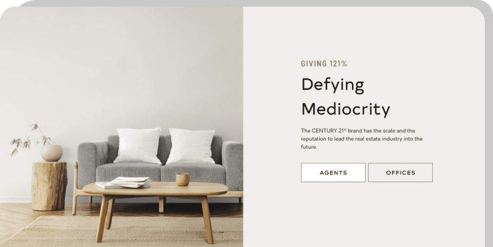
The CENTURY 21® brand has the scale and the reputation to lead the real estate industry into the future. Join us in Los Angeles, CA for our upcoming global conference.
Primary color pairing example for dark backgrounds with light text. This pairing can be used with headings, body copy, links, and UI elements like buttons and forms.
These may only be used where all text shown on them is at least 18pt regular (24px) or 14pt bold (19px, font weight 700) for use in callouts and other small areas where background contrast is necessary in the element to highlight specific content a user will engage with.
All digital designs must meet current ADA & WCAG level AA requirements. These limited use pairings only have contrast levels of 3:1, thus can only be used as backgrounds for large text and graphical user interface components like buttons.
Background:
#DED7C3
Primary Text:
#121212
Alternate Text:
#746649
Links:
#517394 or Button
Background:
#BEAF87
Primary Text:
#121212
Alternate Text:
##746649
Links:
Button Based Only
Background:
#727273
Primary Text:
#FFFFFF
Alternate Text:
#121212
Links:
Button Based Only
Background:
#C4C4C5
Primary Text:
#121212
Alternate Text:
#746649
Links:
Button Based Only
Secondary limited use color pairing examples for use in callouts and other small areas where additional background contrast is necessary.
These may not be used for large page areas, and may only contain large text and UI elements like buttons.

